


Graphic design : Makan modabberi
کانسپت اصلی دیزاین این لوگو برگرفته از سه مسیر ترانزیت دریا ، زمین و هواست، که به صورت متحد به شکل فلش درآمده اند و نشانه انتقال و حرکت هستند. در عین حال تداعی کننده ی فرم حرف سی لاتین نیز می باشد. رنگ های انتخاب شده به ترتیب از پایین ، آبی برای دریا ، وسط سبز برای زمین و بالا مجددا آبی برای آسمان
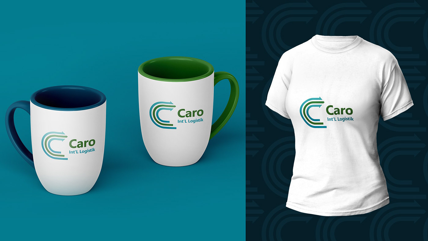
Logo design for CARO International Transport Company (Turkey)
The main design concept of this logo is derived from the three transit routes of the sea, land and air, which are united in the form of an arrow and are a sign of transfer and movement. At the same time, it also evokes the form of the Latin letter C. The selected colors are from the bottom, blue for the sea, middle green for the land, and blue for the sky at the top.
The main design concept of this logo is derived from the three transit routes of the sea, land and air, which are united in the form of an arrow and are a sign of transfer and movement. At the same time, it also evokes the form of the Latin letter C. The selected colors are from the bottom, blue for the sea, middle green for the land, and blue for the sky at the top.


Thanks for watching


